Wealth Tech
How Feedback from Advisers and Clients Is Shaping the Future of WealthTech
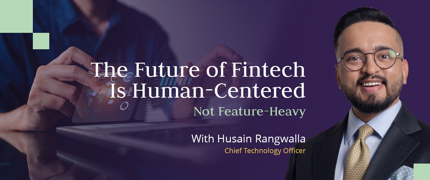
Skybound Wealth's Client App: From Concept to Category Leader
April 12, 2025


This is a div block with a Webflow interaction that will be triggered when the heading is in the view.

For over a decade, the financial-technology industry has lived in a race for more - more apps, more data, more dashboards. The result has been a paradox: as digital tools have become more advanced, most people feel less in control of their money.
The average investor now spends more time navigating technology than understanding their portfolio. At Skybound Wealth, we’ve come to a different conclusion: innovation isn’t about building more technology. It’s about building less - so people can think more clearly.

Every major fintech product begins with the same intention - to simplify the financial experience. But somewhere between ambition and release notes, simplicity gets lost in translation. Features pile up. Notifications multiply. Interfaces start to speak the language of engineers, not end users.
In wealth management, that complexity is more than an inconvenience - it’s a risk. When clients can’t interpret what they see, they disengage. And when they disengage, even the most advanced systems fail their purpose.
Our development team realised that true digital progress isn’t measured in the number of functions shipped, but in the confidence restored to the people using them.
When we rebuilt the Skybound ecosystem, we started with one principle:
If a feature doesn’t make understanding easier, it doesn’t belong. Instead of chasing automation for its own sake, we asked:
Every decision, from navigation structure to colour contrast, followed that logic. The result is an interface that looks minimal, but operates with layered intelligence. We deliberately removed noise - merging dozens of data points into visual clarity - so that human judgment could re-enter the process.
If you want to see how this philosophy works in practice, explore Plume here.
The simplest way to measure success is to look at what people actually do. More than 70% of clients log in weekly, and almost all keep notifications active - not out of obligation, but curiosity. Advisers report that conversations have changed: meetings now start with shared context instead of Excel sheets. The dialogue is about outcomes, not orientation.
That shift is profound. Technology isn’t replacing human connection - it’s restoring it, by taking the friction away.
We believe the fintech sector is entering a new stage - one of maturity rather than novelty. The first era was about building tools. The second was about connecting them. The third - the one that matters now - is about making them invisible.
This maturity phase is less about invention and more about refinement. It demands that fintech companies shift from proving what they can build to proving that what they build actually improves human decision-making. The focus moves from launch velocity to user comprehension; from dazzling features to dependable functionality. In this stage, innovation becomes a discipline of restraint - knowing when not to add another screen, another graph, another click.
When design becomes intuitive enough that users stop noticing the interface, technology has finally done its job. It has grown quiet enough to let understanding lead. It is in that quiet that trust, confidence, and genuine engagement begin to grow.
Simplicity isn’t a design trend; it’s a form of respect. Every minute a user spends trying to decode a screen is a minute not spent making a decision. Data must serve narrative. Numbers mean nothing unless they tell a story that someone can act on. Human guidance remains the ultimate algorithm. Even the best systems exist to empower expertise, not replace it.
In an age obsessed with innovation, clarity is becoming the most valuable product in finance. The future won’t belong to the platforms that do the most. It will belong to those that make the complex feel obvious - where technology disappears, and confidence takes its place.
Clarity is more than an aesthetic; it’s a competitive advantage. In financial services, trust is built when people can clearly see cause and effect: how decisions influence outcomes, how markets shape portfolios, how strategy connects to life goals. The role of design, data, and engineering is to illuminate those links, not obscure them. Every line of code and every visual choice has to answer one question - does this make the client feel more informed and more in control?
At Skybound, that’s our measure of progress. We don’t build to impress. We build to understand. Because in the end, the most advanced technology is the one that helps people make the simplest, smartest choices with confidence.
Clarity in finance shouldn’t be theoretical - it should be something you can experience. Skybound’s digital platform was built to turn these ideas into everyday tools: real-time valuations, simple dashboards, and an interface designed around how people actually think about their money.
Want to see how this works in real life? Book a consultation and we’ll walk you through the platform, your structure, and how clarity can sharpen your outcomes.
Ordered list
Unordered list
Ordered list
Unordered list
A session with our Wealth Tech team can show you how Plume simplifies data, sharpens decision-making, and keeps you connected to your portfolio in real time.
We’ll walk you through: