
Market Update
Q2 2025 Review & Q3 2025 Outlook
Skybound Group Chief Investment Strategist Jabir Sardharwalla reviews fund Commentary: Q2 2025 Review & Q3 2025 Outlook
July 16, 2025


Markets showed modest but respectable gains over the final quarter of 2025. The “periodic table of returns” below by Asset Class and Style Returns summarises this. These returns are even more surprising given the elevated volatility of Q4. What’s really impressive are overall returns, shown in local FX, for the year as a whole. Once again, if you blinked, you missed out, massively!
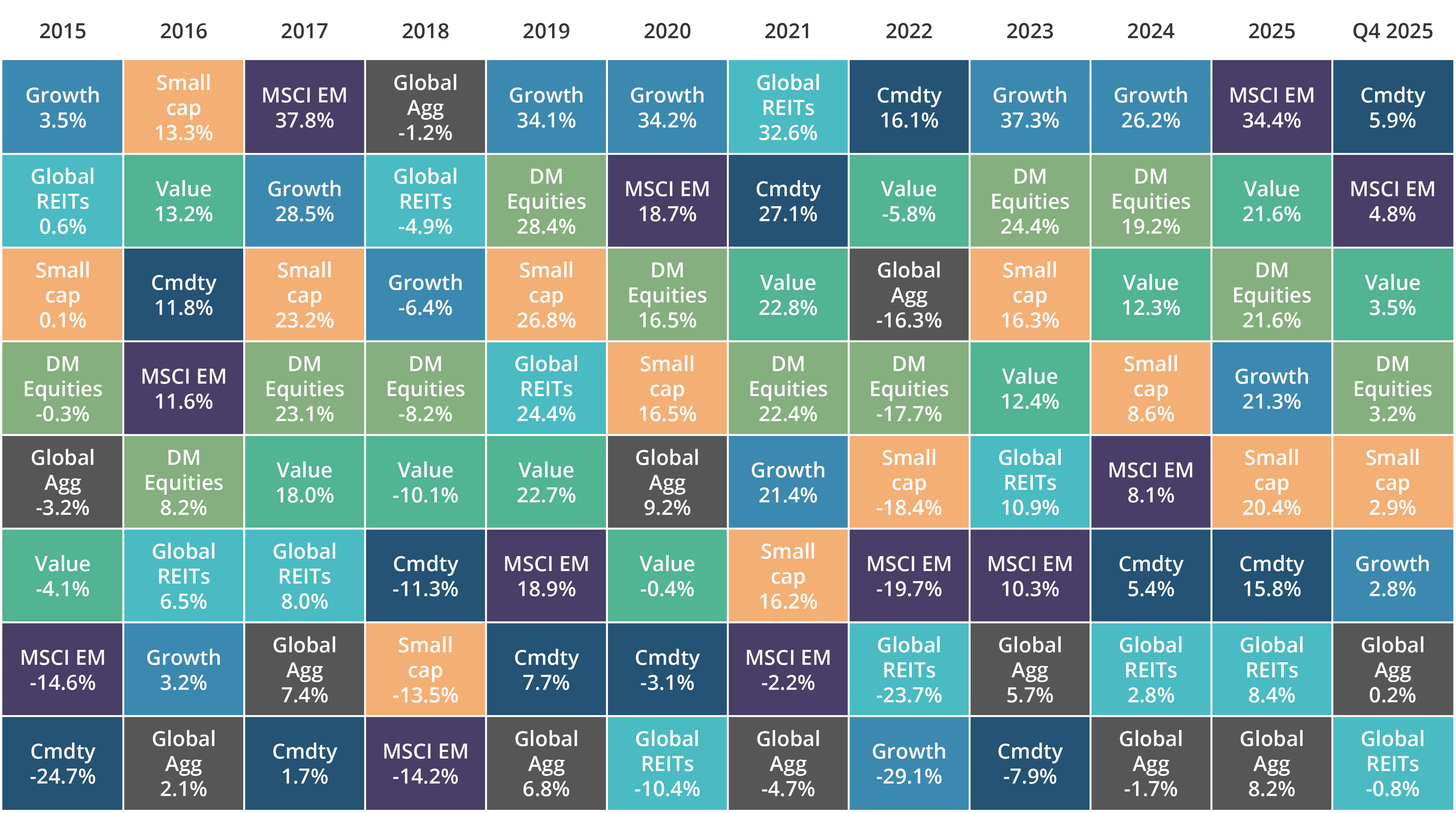
Here’s a summary of key asset class performance and factors driving their returns:
AI remained the dominant theme. This drove US returns which, in turn, drove global returns. Communication and IT delivered +33% and +23.6% respectively – and that’s despite all the bearish talk about an impending dot.com bubble and the AI infratstructure spend about to implode on itself. The S&P 500 delivered an impressive near +18% for the year thereby maintaining its double-digit returning trajectory of yester-years. To think it was out-done by EM (MSCI EM +34%) and Asia (MSCI Asia +33%). Even Japan’s TOPIX returned a very healthy +25.5% while the UK’s FTSE All Share delivered +24% with Europe ex-UK on +20%.
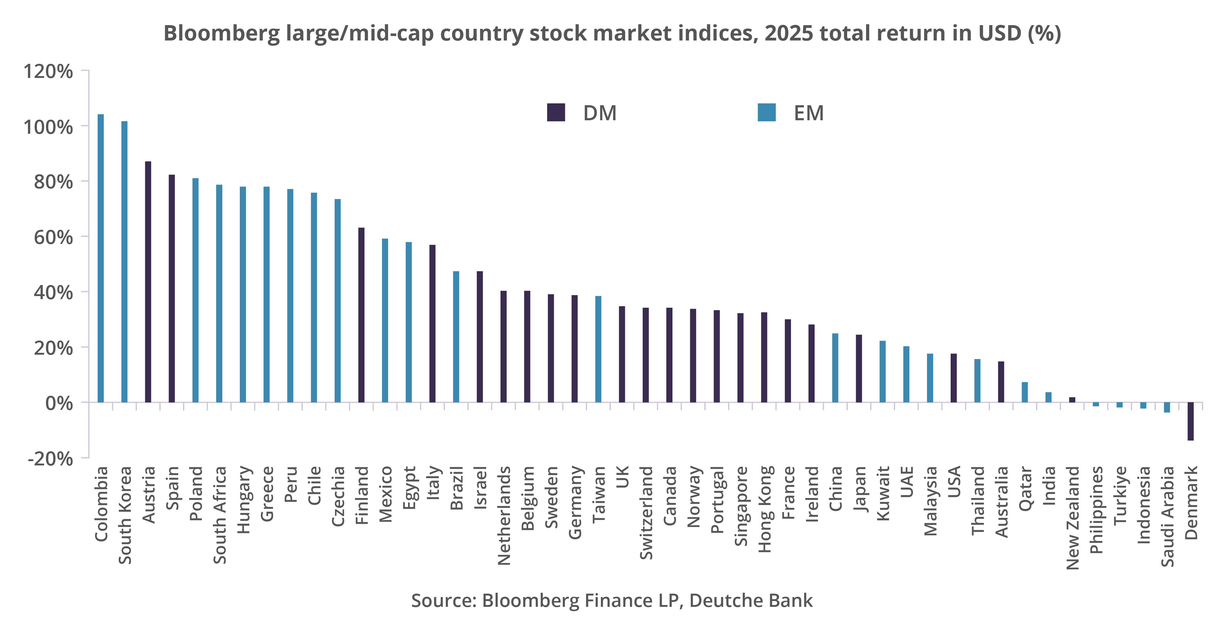
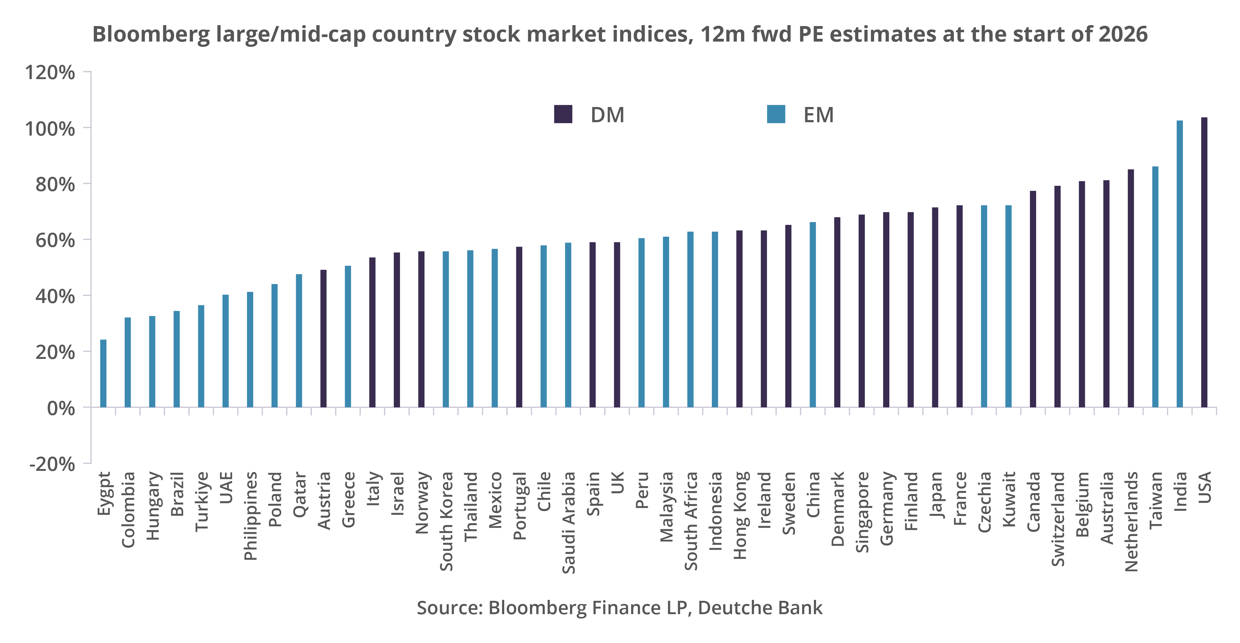
EM performance was broad-based and is depicted below vs DM. It also compares their valuations at the start of 2026:
Consumer-facing sectors struggled on the back of noise around jobs numbers and the decline in consumer confidence. The latter placed a natural
lid on inflation – which has so far been tame. Within the Mag (Magnificent) 7, only two of the its names outperformed the S&P 500!
Saw oil come under even more pressure as a combination o f strong supply and tepid demand continues to drive a surplus. This scenario is expected to dominate in 2026. Furthermore, the slow move towards some sort of resolution in Ukraine has meant a reduction in oil risk premium. Precious metals, on the other hand, have had a volatile but upward trend. US$ weakness has meant a steady increase in prices. This has affected base metals too (e.g. copper).
The rally in risk assets also extended to the fixed income arena. Spreads (a measure of risk) narrowed further but better value was still to be had among US IG (Investment Grade) and HY (High Yield). There were some impressive returns delivered over 2025: EM Debt +13.5%, Global IG +10.3%, Global IL (Index-Linked) +9.1% and US HY +8.5%. I the world of Sovereign (Government) bonds, Global Gov. +7%, US Treasuries delivered +6.3% and UK +5%. Contrast these with Euro Governments +0.6% (France remains in gridlock and has proved itself to be unable to reach a compromise on a deficit reduction plan) and German Bunds -0.9% as the country decides to relax fiscal tightness and vastly increase spending). The worst performer were Japanese JGBs at -6.2% (due to a shift away from keeping rates down and letting them normalise).
The US$ was down -9.4% on the year – improving over Q4. Overall, considering everything that went on (geopolitics, tariffs, etc.), that’s an impressive performance. The GB£ gained +7.5%, the Euro +12% and Yen -0.5%. The primary catalyst for these moves: the Fed’s easing cycle – and the expectations that it will go even further.
So where to from here?
Here are some of the key factors likely to affect Q1 and the rest of the year:
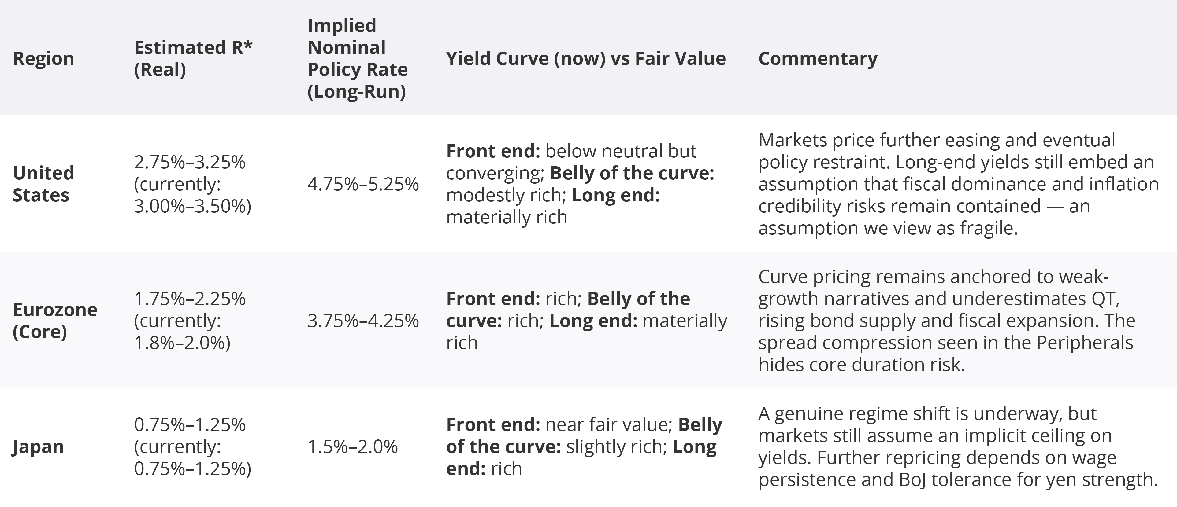
When it comes to the economy, markets will be watching carefully to see if an equilibrium can be maintained between an economy operating at its full potential (generally deemed to be full employment) alongside stable inflation (i.e. what is deemed to be its target level). This is how R* is defined. This then determines bond yields (which is reached by markets). The latter will define debt-servicing costs! The table below summarises various, indicative levels for R* alongside yield curve calculations (based entirely on what we know to be the case today) and assesses how does today’s yield curve look if we strip out cyclical noise?
The answer to this is split between the three segments of a yield curve i.e. its Front-end (typically up to 2 years), it’s “belly” (the middle part, typically over 2y up to 7y) and lastly (and very importantly), the long end (10y+). The upshot: the front-end of the yield curve (YC) remains suppressed by expectations of near-term easing; the belly still has embedded in it an assumption that the low-rate regime eventually returns; however, here’s the danger: the long-end remains anchored to the precovid norms we experienced and this is increasingly inconsistent with higher debt, higher R* and less credible policy! While the above is not a call on timing…..it is a structural observation i.e. the longer markets cling to outdated anchors (i.e. the post-GFC assumptions that neutral rates are structurally near zero, long end yields can be suppressed indefinitely and fiscal excesses will self-correct), the greater is the risk of adjustment and the stronger the force with which it will be delivered (whiplash).
My last quarterly referenced sources (e.g. McKinsey) that looked at the success of GenAI pilots. It openly challenged the efficacy of many of them. The worldwide adopted use of GenAI (for 2025) is already in the order of 15% to 20%. Of course, this is by no means even e.g. top quartile sector adoption is running at 40% to 50% while among SME adoption it is less than 10% globally. However, projected growth rates for 2026 to 2027 are almost double these rates! Furthermore, when one drills down to “chip category” (e.g. AI Accelerators GPU/ASIC, Data Centre CPUs, DRAM/HBM, etc.), the projected growth rates are “Strong to Very Strong”. In this regard, the chart below (source: Aviva) shows what the projected Hyperscaler CAPEX levels are (Oracle, Microsoft, Meta, Alphabet and Amazon).
These levels become even higher if one looks beyond the hyperscalers. It also highlights the risk – the sheer quanta involved is a material portion of their cash piles. We are not concerned by the odd $1bn here and $2bn there…….however, these amounts matter. So the growth rates referred to above need to demonstrate rising growth to support scale and therefore economic returns on CAPEX investment. This enormous demand for AIequipment results in an ever-growing demand for energy (next section).
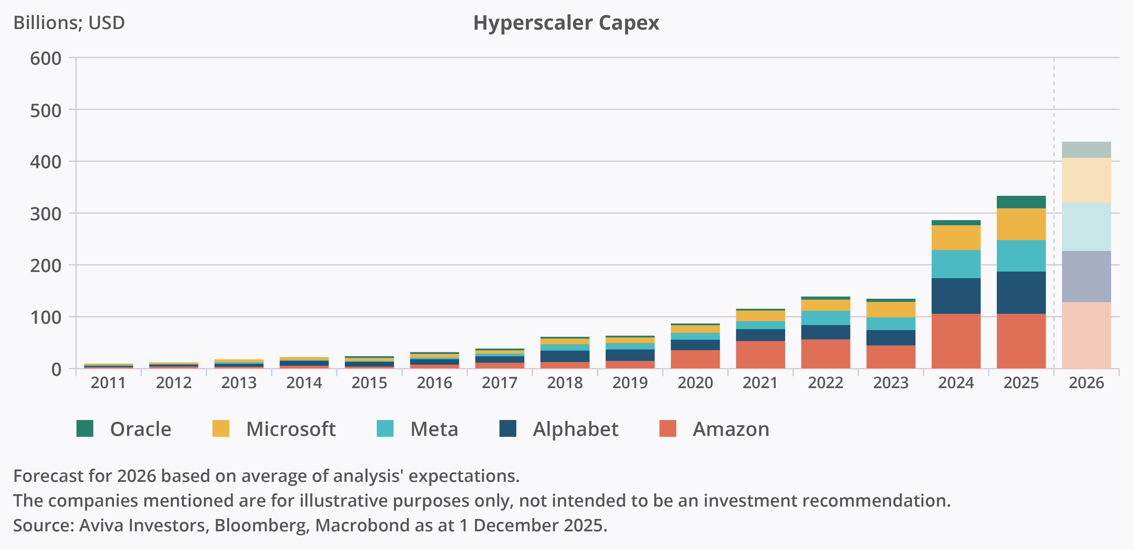
We think AI-related capex spending could become an increasingly important global driver of business investment. The major US “hyperscalers” are expected by analysts to increase their capex to around $500bn in 2026 (Figure 2), over three times their level of annual capex prior to the arrival of ChatGPT and other Large Language Models (LLMs).
While the hyperscalers are expected to reinvest the bulk of AI-related investment over the coming years, we also expect investment across the major adopter industries (e.g. financial and business services) and supporting sectors (e.g. utilities and industrials) to rise as business practices are transformed and as demand increases.
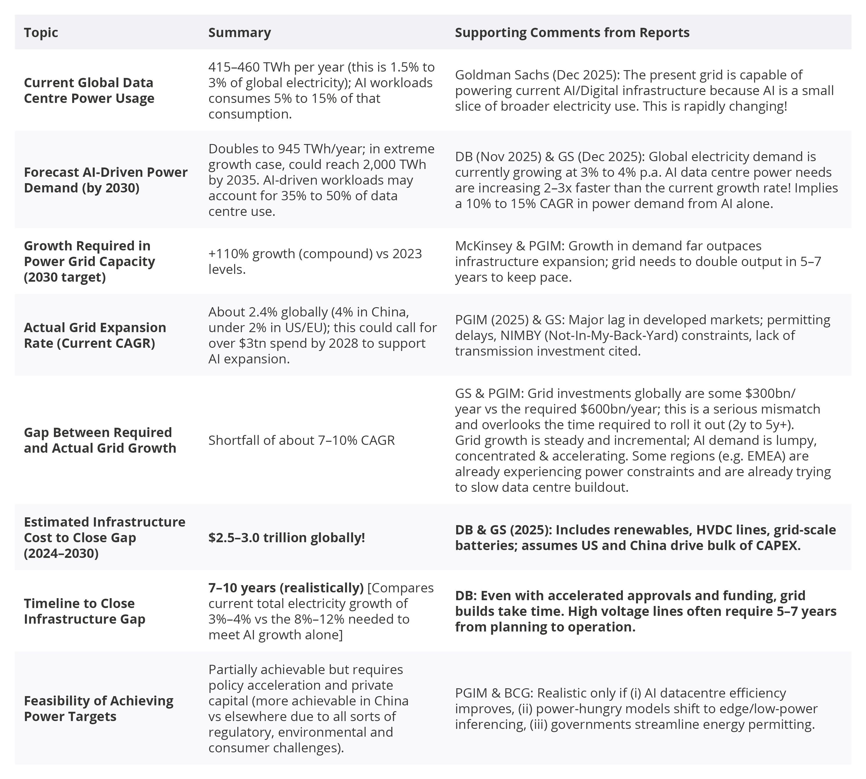
To facilitate the growth in AI Infrastructure, the table below best sums up the sheer power load needed for the projected growth rates ahead.
Right now, Global Data Centres use up 1.5% to 3% of all total global electricity usage. Of this, some 5% to 15% is consumed by AI workloads. Given the vast growth rates projected, how will energy production keep up? 80% of all energy production is hydrocarbon generated.
The growth rate in non-hydrocarbon is simply not fast enough….and even if we go all-out hydrocarbon, the refining rate can’t keep up (not enough refineries, many are obsolete). There is the ever-present risk of geopolitical disruption – though this has alleviated considerably with developments over Russia-Ukraine and now with recent US events over Venezuela.
Most analysts would list a string of risks – and I am sure they could make a case for any one of them. The one that concerns me the most is inflation. What we have seen – and why it is different this time round – is the multi-variate nature of it. Services inflation has become sticky. Within that, key items such as food are even stickier and running at alarmingly high levels.
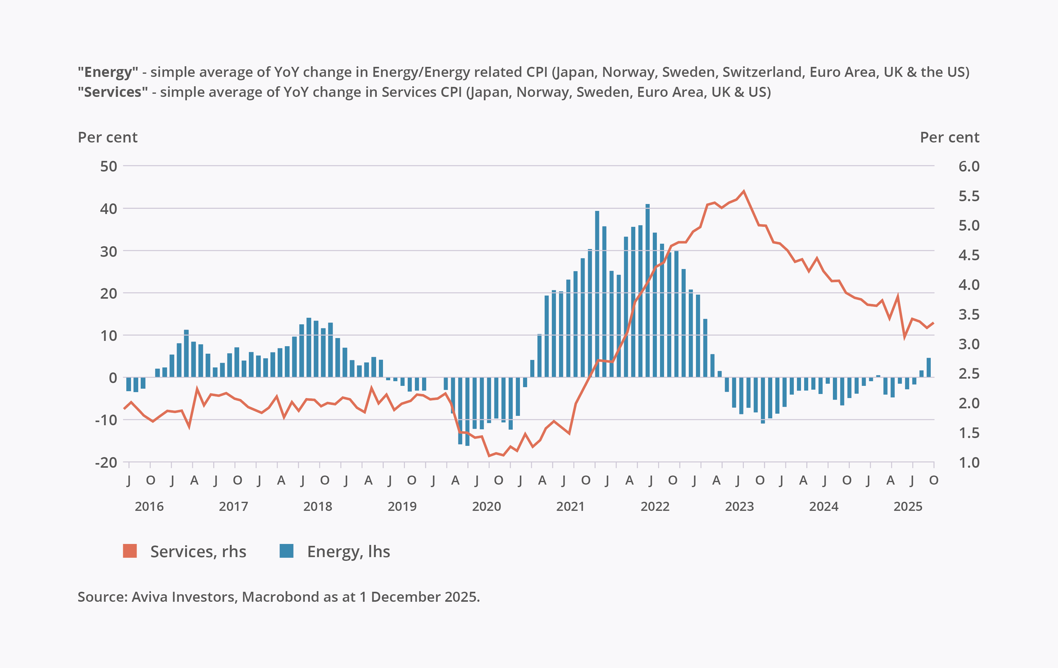
To cap it all, given the above analysis around energy, there’s every argument energy costs cannot sink that much lower from here. If this view materialises, then we can circle back to the very first point around R* and Bond Yields. We have seen what happens when yields start rising….. and we already know what debt-servicing costs are being incurred by countries. The chart below is a good point to end on. It highlights the drag we have seen from energy inflation is over while services inflation remains sticky. Furthermore, if energy inflation picks up sufficiently, it feeds back into services!
Thank you for your continuing support as always – we really value it and please reach out to us if you have any queries.

Stay up-to-date with financial news and insights delivered straight to your inbox. Sign up today.